Tumblr Year
in Review 2023
ROLE: ART DIRECTION, VISUAL DESIGN, OVERALL CREATIVE STRATEGY
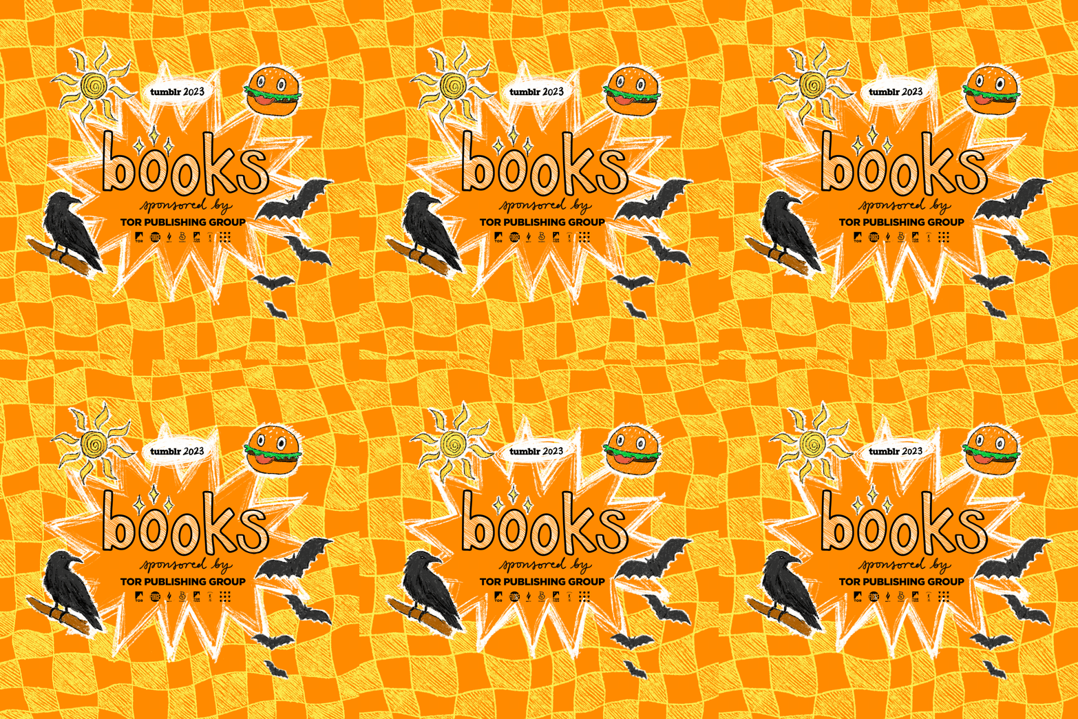
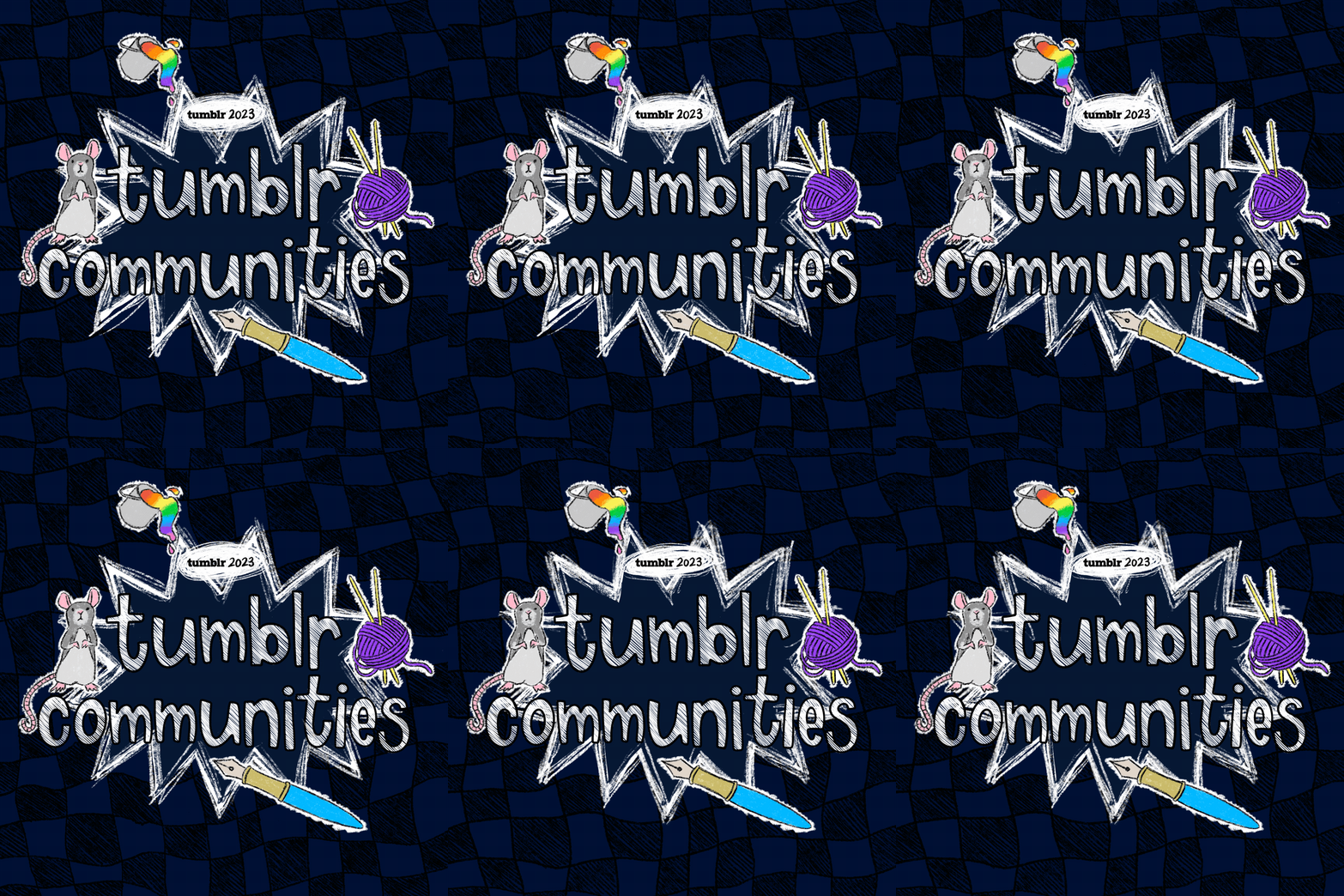
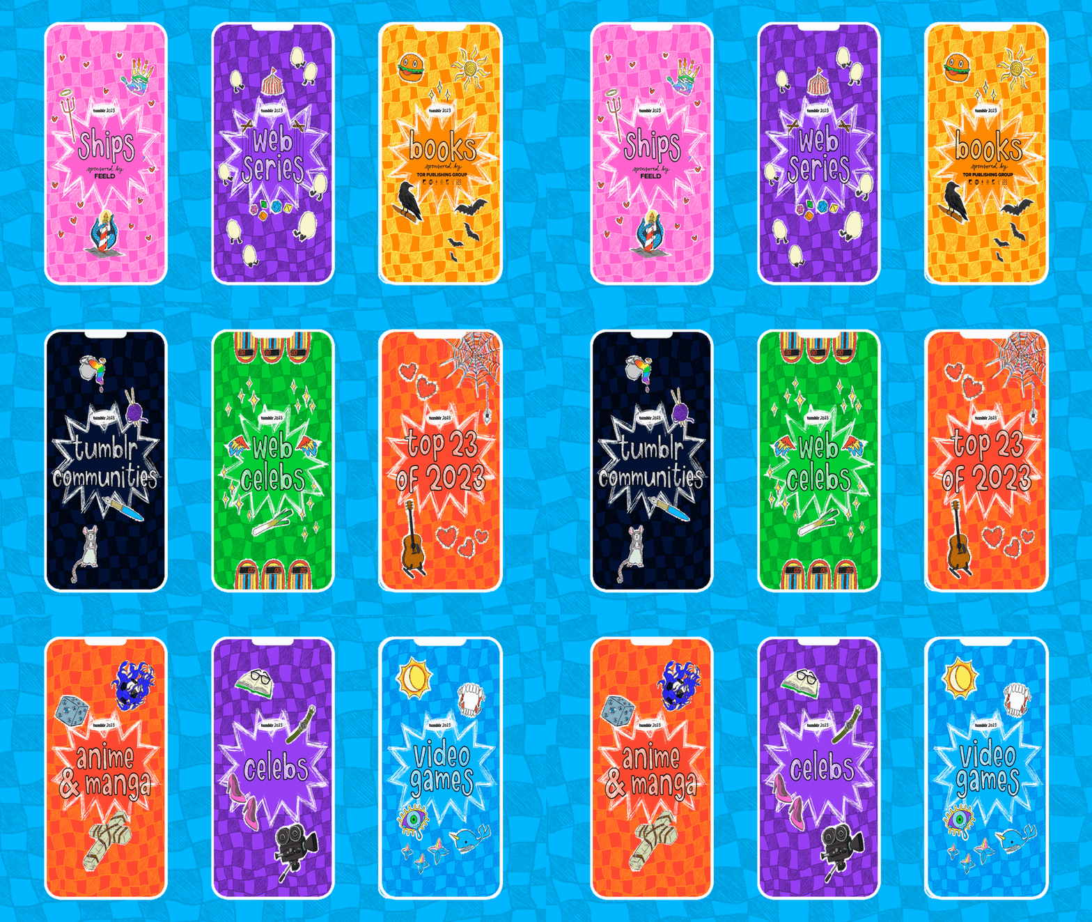
The annual campaign reflects the yearly Tumblr trends in the form of lists on fandom.tumblr.com, the official guide to fandom on Tumblr. The goal was to showcase each topic through the use of brand colors, and iconography. A total of 15 individual post headers were created for the campaign, in addition to various other graphics designed for digital spaces within and outside the Tumblr platform.
COLOR & TYPOGRAPHY
•
COLOR & TYPOGRAPHY •
With the goal to reflect various fandoms on Tumblr, the Year in Review color palette employs the official brand colors to create a captivating visual experience and to create a sense of familiarity. This dynamic range of colors serves as a powerful tool in conveying the essence of each fandom. From the electric blues of game enthusiasts to the fiery reds of passionate anime fans, this thoughtfully curated palette reflects the kaleidoscope of interests and passions that thrive within the Tumblr ecosystem.
The font chosen for this marketing campaign is not just any generic typeface; it is a font that has been meticulously crafted using my very own handwriting. This attention to detail ensures that the visual graphics exude a sense of authenticity and approachability. By utilizing a font derived from my handwriting, the campaign aims to establish a personal connection with the audience, making them feel more connected to the message being conveyed. This unique touch adds an extra layer of charm to the overall aesthetic, setting it apart from other campaigns that rely on standard fonts.
VISUAL GRAPHICS
•
VISUAL GRAPHICS •
SOCIAL PROMOTION
•
SOCIAL PROMOTION •
Campaign Coordinator: Cates Holderness
Art Director & Lead Designer: Jasmine Ho
Editorial Copywriters: Bea Vantapool, Loll Junggeburth


